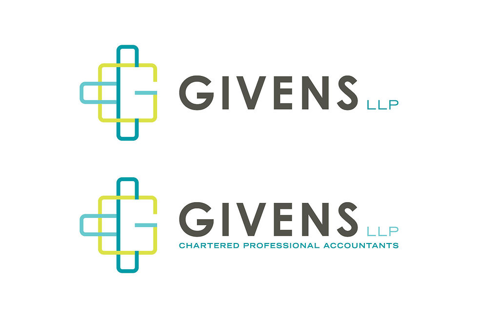
Givens LLP branding
- Kristin
- Sep 6, 2018
- 2 min read

This year, I worked with Ed Marketing and Communications to complete a brand redesign for Givens LLP. Givens is a professional accounting firm with offices in three locations, Edmonton, Elk Point and Fort Saskatchewan. The firm partners wanted to create a new brand for their organization that would touch on the history of the company but really push the boundaries of what is typically seen for accounting brands. They wanted something that was mix of formal and fun and that would appeal to new clients and employees while also being a brand that their current employees could embrace.
sketches:

The previous Givens logo was a signature that they had held on to for a long time. I wanted to explore options that played with the signature concept, but also options that took the brand in a whole new direction, infusing meaning and depth into all the logos that were presented to the client.
initial concepts:

For the initial concepts, I wanted to infuse the idea of teamwork into the designs. Givens has such a well rounded team of people who are working for all of their clients, and that is part of what they have built their reputation on. They strive to build strong relationships with their clients and always be a company you can depend on, someone who will answer your calls, return your emails, and let you know you are in good hands.
With all concepts that I present for logos, I always include explanations of my thought process behind each design. The logos that are the most successful are the ones that have that deeper meaning to them, beyond just looking great. The elements within the design should speak to what the client is about, and visual metaphors and techniques are a great way to communicate that.

The client was thrilled with the initial designs when presented, and took the black and white concepts back to the office to think about and land on the selected design. The design selected was the woven concept, which was always one of my favorites. From selecting the concept, we moved to colour. Because Givens wanted to move in a more current direction, I presented colour options in a range of brighter colours that had a bit more punch, complimenting that with strong neutrals that would support them.

The final logo design made use of bright teals and yellow-green to really give the brand the pop that the organization was looking for. We created a second version of the logo with the full Charter Professional Accountants title, to be used when more clarity on what the organization does is needed.
We have since applied this logo on to everything! Business cards, letterhead, envelopes, folders and more, this logo has been easy and successful to apply across all mediums.
Givens LLP online and they are an amazing group for any small business needing an accountant.

Comments