Harmonic Spaces Branding
- Kristin
- Sep 6, 2018
- 2 min read
Another new logo I completed for Harmonic Spaces. Harmonic Spaces is a decluttering and organization service that helps out those people who can't find the time or energy to let go of all those extras hanging out around their home. Stephanie, owner of Harmonic Spaces, wated something that was warm, inviting and unique.
sketches:
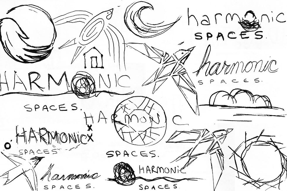
I brainstormed extensively to come up with visuals and ideas that communicated the experience of working with a personal organizer.
initial concepts:
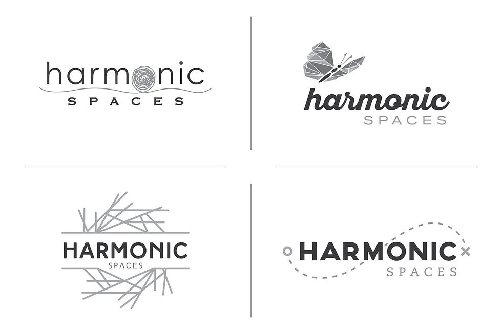
I came up with quite a few different visual metaphors for the initial concepts I designed for Stephanie. I explored freedom being communicated with a butterfly, the organizing process with a well structured nest, detangling your life with a tangled ball, and working your way from start to finish like a treasure map.
version 2:
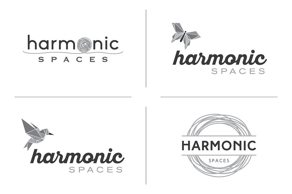
Stephanie reviewed those initial concepts, and really loved all of them. She asked to see some additional variations of the designs to help her firm up her direction.
version 3:

We settled on the hummingbird as the direction of the logo. Hummingbirds are light and airy and give that message of taking flight and moving forward. I created a few alternate versions with different birds and fonts for consideration.
version 4:
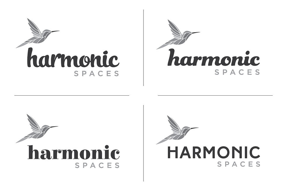
A bird was selected, now we just had to iron out the font. I presented a few fun and fresh options as well as a more structured font to offset the flow of the bird.
version 5:
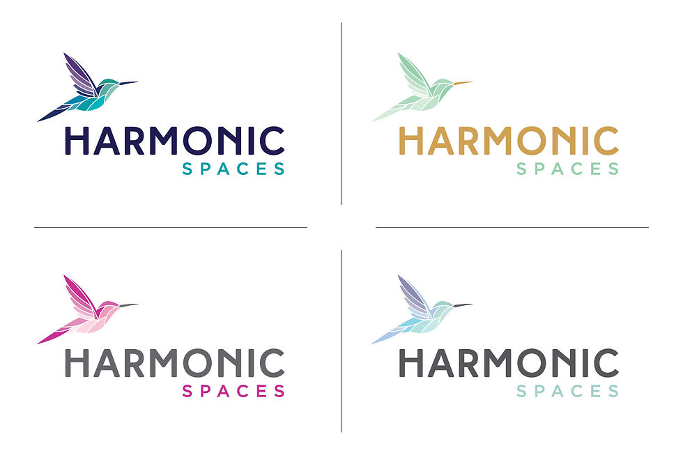
The design was done, it was time to go to colour. I showed quite an extensive selection of colour for Stephanie to look at and she ultimately decided that pink was the perfect fit for her. This design definitely took more back and forth, but getting to that final design that the client is thrilled with is what it is all about. When the client reaches that final result that they are happy with, that is the big payoff and what I get excited about.

Комментарии