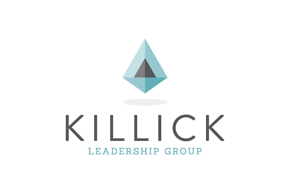
Killick Leadership Group Branding
- Sep 6, 2018
- 2 min read

I was recently approached by Cathy Goulet from Killick Leadership Group to take a look at her branding. She already had an existing logo but was looking for a new design that better reflected her company. Killick Leadership Group specializes in strategic planning, group facilitation, community engagement consulting, leadership development and coaching services. They focus on creating simple elegant solutions for their clients, with a focus on a value and solution driven ideas.
The killick in her name (which is a type of anchor) was important to keep in the design, as it is a strong centre point of her brand and has even commissioned a craftsperson to make her killicks to give to clients at the end of projects.
sketches:

In the sketches, I was very focussed on how I could visually reinterpret the killick as an icon, and make it more modern and clean. The previous logo was a sketched, true to life version of a killick, but I wanted to create something a bit more abstract but maintaining the overall shapes of a killick.
initial concepts:

In the initial designs, I played with various type solutions as well as layouts that fit with the icons I created. I tried to show a range of geometric icons and more flowy icons to give a good range and variety in the solutions.
colour concepts:

Cathy immediately knew that the facet style design was the perfect design for her. It was light and airy and captured all that she was hoping to say in the new design. For colour, she really wanted to try out water tones, which made perfect sense with the icon and her roots in the maritimes. I presented several options that used blues and greens, as well as a chartreuse option, just to give something different. She selected the the teal and grey combination and we were done and ready to move on to the business card.
Find Killick Leadership Group online at www.killickleadership.com


Comments