Predicable Futures Inc. Branding
- Kristin
- Sep 6, 2018
- 1 min read

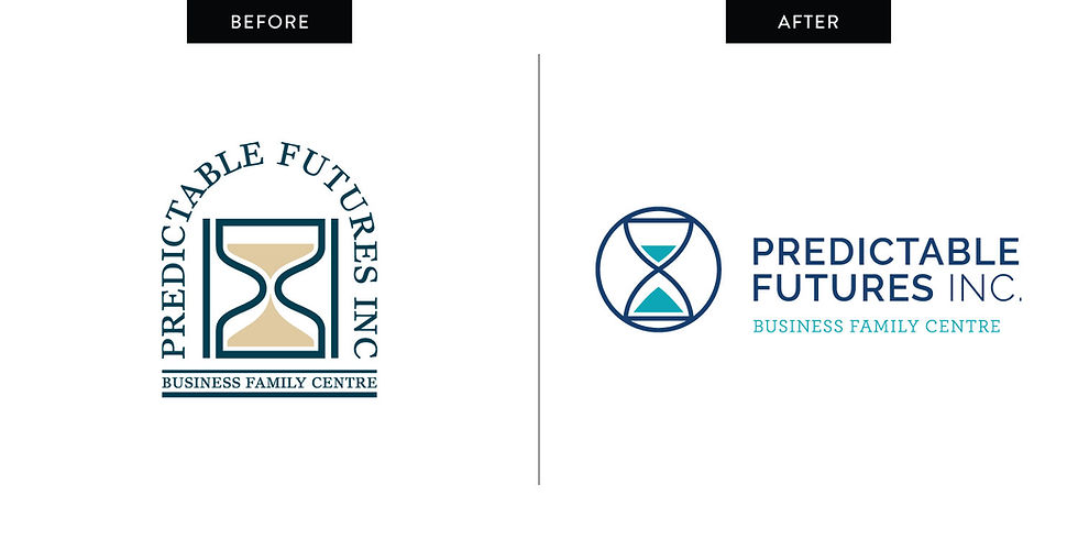
This branding project was a slightly different situation than I normally have. Ed Marketing had a client that wanted to have their logo rebuilt, to rearrange the type in the design. This logo had been around for a long time and it was starting to show it's age. Erin, with Ed Marketing, had finally convinced him that he should consider a new design, and I was asked to create it for him. The challenge? One concept. That was it. And it had to still incorporate the hour glass that his original logo had.
sketches:

Saying it was nerve wracking to do just a single design is putting it lightly. It made me very aware of just how much I enjoy approaching a logo from multiple angles and giving my clients choices. I really love helping guide their choice so they end up with the brand that is best for their company. I think it makes a client feel more passionate about their brand when they feel like they helped to create it. That being said, sometimes you only get one shot, and you have to try and get it right the first time.
the before & after:

I emailed the design to Erin, and she came back with a bit of feedback which I made and Erin sent off to the client. The result? He loved it! It wasn't so much of a change that it terrified him, and it still maintained all the parts of his original design that he enjoyed, but freshed it up and made it more modern.
I love working with Ed Marketing, they always have fun and challenging projects to work on.

Comentários